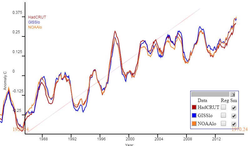
Sou has been tracking the average so far in this calendar year. Steve Bloom doesn't like non-physical calendar periods, and prefers the running average. I think Sou's analysis makes sense. It is the best guide to the 2015 year average, since it uses data from that year only. One could say people shouldn't focus on arbitrary year divisions, but they do.
However, if you want running twelve month averages, they are available at the maintained active plot. Just click the buttons on the side table headed Sm. twelve month running is the default (and only) smooth. Here is an example:
However, in this context, I'm a fan of polar, or radial, plots. Here curves track like a clock with time, with radial distance indicating temperature or other plot variable. I use it for ice extent here. Then there is a natural period of a year, but that isn't essential. The point is that by rolling it up, a long stretch of time can be covered with good resolution (but crowding).
So below the fold I'll show radial plots (with decade winding period) for the main surface indices, from 1950 to now. They will show clearly how warming has continued, as the curve spirals outward, even during the "hiatus". Now they are at record radius, and that is very likely to increase, at least for a little while. The reason is that the change in moving average depends on both the new readings, and the old readings that they replace. Mid-2014 was a relatively cool period, so as long as 2015 is warmer, the running mean will increase.
In these plots, there is a continuous curve in rainbow colors, violet in 1950, and ending with red now. It goes clockwise, 36°/year, crossing the y axis every decade as marked. Radial distance represents temperature anomaly (according to the source) as marked on the x axis, and shown with faint circles. The running mean is centered, so the latest at the bottom shows as Dec 2014.
So here is the NOAA Land/Ocean plot. A curiosity here is that the NOAA report says the maximum 12-month average is 0.83°C; I get 0.81, on their data. But the pattern is the same. Spiralling outward indicates warming, and it is clearly happening, with minor variations, since about the third circuit (70's). And it is now at record level (and has been for six months), and heading outward.

Here is GISS Land/Ocean, which looks much the same:
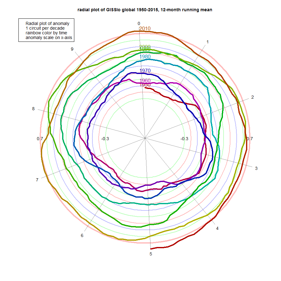
And here is HADCRUT 4. It probably shows the least adherence to uniform growth, and has more pronounced excursions in 1998, 2005, 2007 and 2010. It's still well in front now, though.

2015 will be a record year if the curve stays outside to previous levels for six more months. And as I said above, a month or two more of expansion is very likely, just on the basis of cooler mid-year 2014.
ps Arctic ice had been holding up fairly well. But it is showing signs of downturn in the last five days, dropping below 2010, and close to 2014.


It's a very exciting time for watching surface air temperature, so to heck with the running average. After some 4 years of listening to the pause diarrhea at Climate Etc., I'm enjoying a front-row seat at the dismemberment of the little arms on the stadium wave.
ReplyDeletei personally think it is a very exciting time for watching air temperature adjustments .for instance, i cannot wait to see what the real temperature was on my birthday ten years ago .
DeleteWell, the local index TempLS uses unadjusted GHCN air temperature data. hasn't changed in ten years. It makes very little difference.
DeleteThank you Nick. Let's find them a surgeon who has made no adjustments/improvements on his techniques since, say, the Civil War.
DeleteNick: Well, the local index TempLS uses unadjusted GHCN air temperature data. hasn't changed in ten years. It makes very little difference.
DeleteBut it uses ERSST v4, which does adjustments.
Yes, but it is "air temperature adjustments" which brighten up Anon's day.
DeleteYou could add a little extra brightness to Anon's day, by using raw, unadjusted sea surface temperatures. I wonder what effect that would have?
Delete:-)
Nick: Yes, but it is "air temperature adjustments" which brighten up Anon's day.
DeleteIn an effort to pick on Anon, I think you've engaged in over-parsing his words here
Granted ERSST temperatures aren't air temperatures, but they are used to estimate 1-m elevation SSTs. So adjustment to the ERSST data product do affect the global mean surface air temperature estimates.
Mind you, I'm not objecting to adjustments, but since recent temperature records were created from these new adjustments, it would be perhaps disingenuous to suggest that these adjustments aren't important. (Assuming you think the new records are "important").
This does remind me that, unfairly, little attention has been given to sea surface temperature estimates.
Nope Carrick. The records were not "created" from these new adjustments. ERSSTv3b without these adjustments in 2014 was on record level (and still is of course).
DeleteIs it diisengenuous not to check?
Actually, I was referring to 2015 records, which if I've followed Nick's posts correctly were generated by the transition from ERRSTV3b to ERRSTv4.
DeleteAs to being disingenuous... I take it people can no longer say things that you may disagree with, without you imputing their motives. You must be a lot of fun at parties.
Carrick does not like to check. It has nothing to do with being diisengenuous. Of course. SST without the adjustments for 2015 is also on record level. Higher than 2014.
DeleteSo Carrick's claim that recent temperature records are created from these adjustments is just untrue. It is just a bit hard for Carrick to admit that. Diisengenuous has nothing to do with it.
Carrick, This ain't no party. this ain't no disco.
DeleteIf you want to fool around, go elsewhere.
As it happens, I've looked at the effect of the adjustments and it is true that 2015 records were "created" by going from ERSSTv3b to ERSSTv4.
DeleteCarrick, which records were created by ERSST v4 adjustments?
DeleteJMA got new records in March, May and June 2015 without adjustments.
HADCRUT4 got new records in March, May, and likely also in June without adjustments.
The 12-month running mean records have been broken month by month during 2015, in all global datasets, new and old.
The high temperature trends of the recent century in the "adjusted" datasets is not a novelty, it was already there in Cowtan&Way, BEST and TempLS Mesh
Olaf—I wasn’t t discussing JMA (which I never look at) nor HadCRUT. Nor am I disputing that we are currently in a warm period for Earth’s climate over the last say 6000 years at lest.
DeleteSecond, I absolutely recognize the need to make adjustments to data, when those adjustments improve the accuracy of the measure.
Third, I’m not sure what you’re suggesting by “The high temperature trends of the recent century in the "adjusted" datasets is not a novelty…”. Nobody is disputing the reality of the trends.
Now I will admit I am significantly a curmudgeon when it comes to comparing unsmoothed monthly records against each other. By picking a particular month of a 12-month series (without smoothing), you are under sampling the data series, which by aliasing, means (when the records are small) that you are basically just looking at noise.
I do think the trends are meaningful, but of course, you have to wait a longer period to decide whether the recent records are part of a trend, or just some random ENSO created blip (odds are on “blip” in my opinion).
The only point I was discussing was Nick’s comment that he didn’t use adjustments (technically he’s right that he doesn’t use adjustments for LAND temperatures, but that’s just 1/4 of the area of the Earth). Nor is it actually true that the effect of the adjustments are uninteresting.
To answer your question, I was looking at GISTEMP with ERSSTv4 and compared it with GISTEMP ERSSTv3 and HRSSTv2. As far as I know, they don’t quote the global mean temperature series for all three of these SST series, which of course complicates things.
They do have on-line tools you can use to pull 2*x2* gridded data for each of these cases. I wrote a scraper to pull these down, and then area averaged them. For the rare cases where there were missing grid points, effectively I averaged over the latitude containing that (those) missing point (points) and infilled. This is more accurate than what HadCRUT does (which is effectively replace the missing points with the global mean, a very poor assumption).
Anyway, here’s some of the new records (by my current tally there is just one new GISTEMP record in 2015):
Jan: no change (2007/0.965°C)
Feb: 2015/0.876°C (was 1998/0.861°C)
Mar: 2010/0.195°C (was 2002/0.885°C)
Apr: no change (2010/0.864°C)
May: no change (2014/0.858°C)
Jun: no change (1998/0.789°C)
Jul: 2009/0.759°C (was 2011/0.712°C)
Aug: no change (2014/0.787°C)
Sep: no change (2014/0.906°C)
Oct: 2014/0.832°C (2005/0.770°C)
Nov: no change (2013/0.806°C)
Dec: 2014/0.793 (2006/0.754°C)
That means 5/12 months saw a new record in a different year, and for 4/12 months the newer record occurred in a more recent year than the previous one (this shouldn’t be a shock given that using ERSSTv4 gives a significant increase in total trend in global mean temperature:
<a href="http://data.giss.nasa.gov/gistemp/updates_v3/ersst4vs3b/v4-v3b.gif”>Figure.</a>
"Mind you, I'm not objecting to adjustments, but since recent temperature records were created from these new adjustments, it would be perhaps disingenuous to suggest that these adjustments aren't important."
DeleteWhat does this disingenuousness boil down to? February 2015, December 2014 and October 2014 got records with ERSTT4 in Gistemp. "Recent temperature records created from these adjustments". But of course, "recent" is a very moving goalpost.
Truly impressed Carrick.
As for ENSO, these records were reached not in El Nino conditions, but in ENSO neutral conditions.
DeleteWhat did they say at Pearl Harbor? Are those blips birds? Better ask upstairs. No, don't worry. Those blips are our B-17s. Boom boom boom!
This comment has been removed by the author.
DeleteJCH: As for ENSO, these records were reached not in El Nino conditions, but in ENSO neutral conditions.
DeleteThe ENSO indices are simple averages over different sectors of the Pacific ocean, and ENSO positive, negative and neutral are frankly arbitrary thresholds. This is an attempt to collapse a complex phenomenon into simple metrics that are easy to interpret, but the price is you lose a lot of science by doing this.
I just don’t think you can look whether the ENSO matrix has passed some magical threshold to decide whether or not the ENSO is affecting the currently observed temperatures.
ehak, three new records have been created in the last twelve months by adopting the probably more accurate ERSSTv4 series. Most reasonable people would agree that corresponds to “recent”.
DeleteCarrick - I do not think there is a time when ENSO is not effecting the GMSAT. ENSO is a big.
DeleteIf the adjustments are correct, then adjustments did not set records, the climate system did that.
Those are intuitive & compact plots that could definitely complement standard XY plots for long periods.
ReplyDeleteNick, I take it the rainbow doesn't mean anything. Or does it?
ReplyDeleteSince the plot is cyclic, it might be interesting to use color to show anomaly over anomaly year earlier, or rate of change over year earlier, or some other characteristic which might be sympathetic to annual periodicity.
I probably can't find them, but 30 years ago, with the advent of the office pc and having some time, I fooled around with plotting annual data in a colored helix with height and radius parameters, as well as the color. The view was an oblique isometric. No-one else was able to understand them, maybe I didn't either. But yet...
jf,
DeleteThe color is just my way of ensuring that sections from different decades were distinguishable when they overlapped. I use rainbow because it is a familiar sequence.
I can't see a good way to use it on an annual scale. There are only 12 points per year, and then a lot of years (hence the use of decades). I think your 3D ideas are interesting to help make the trajectory easier to follow, though as you suggest, that has its own complications.
JCH: Carrick - I do not think there is a time when ENSO is not effecting the GMSAT. ENSO is a big.
ReplyDeleteThis is a truism, but I think it's missing part of the point:
The way I see it, there is a high correlation between the temperature in the region of the Pacific dominated by the ENSO and the ±30°. latitude band. So for periods of 2-5 years, the fluctuations in this band are driven almost entirely by what happens in the ENSO region.
This statement is still true, whether you add or subtract a constant from a particular ENSO temperature index. The correlation coefficient between two series that are oscillating in the frequency band 1/5 - 1/2 years^-1 is trivially unaffected by the addition of an offset to one of the series.
If the offset is generated by other longer period oscillations (without a redefinition of the series similar to what WHT is doing), these offsets won't get fully subtracted when you detrend the ENSO average. (I'd have to investigate MEI a bit further to see what happens there, but my speculation is that you'll get contamination in the MEI index from AMO generated fluctuations).
Anyway, in my opinion, that's the problem with using fixed thresholds: It is sensitive to an over all bias in the mean value generated by longer period fluctuations. An temperature acceleration based metric would likely be more robust, if also quite a bit more obtuse for laypeople to interpret.
What I would say is actually important is that we are seeing an upward trend of the ENSO index, and that's forcing an upwards trend in temperature. Given that we are likely to see a strong ENSO this year, I expect to see more new records set as we go along, especially in series like HadCRUT which effectively over-weight the regions most affected by ENSO.
But the important thing is not to mistake short-period trends (which likely will continue to have both signs as we move forward) for longer period trends.
If the adjustments are correct, then adjustments did not set records, the climate system did that.
The first question should be whether the records are meaningful. If they are monthly records and they amount to just a few hundredths of a °C, I would say not so much (the bias in the measurement is probably larger than this, and as I've pointed out above, by selecting a single month without smoothing to annual first, you're aliasing in high frequency noise).
The fact that the (generally recognized as inferior) global mean temperature series from HadCRUT is showing large records is actually evidence (to me) of the importance of making adjustments of the Cowtan & Way variety. If you compare "unadjusted" HadCRUT to the adjusted records (using e.g., kriging), the recent two records from HadCRUT disappear once you account for the "missing" surface area of the Earth:
2007.04 0.832 2007.042 0.531
1998.12 0.763 2010.292 0.485
2015.46 0.728 2010.208 0.454
2002.12 0.705 2014.708 0.437
2002.21 0.699 2002.208 0.431
2006.96 0.698 2014.375 0.425
2015.38 0.696 2014.792 0.413
2015.04 0.688 2013.875 0.412
2015.21 0.681 2010.875 0.412
2010.29 0.679 2006.958 0.401
Adjustments are important, because they allow a more accurate determination. But one of the point of the adjustments is that series that don't make the adjustments are typically going to be less reliable than those that do.
JCH---managed to break the subthread sorry.
ReplyDeleteThe left column above is HadCRUT sorted by warmest temperature. The right column is HadCRUT + Kriging from Cowtan and Way's website, also sorted by warmest temperature.
Sorry Carrick, you have to redo the numbers. There is a new version Hadcrut 4.4 out now. No adjustments per se, but a lot of new stations and data in CRUTEM. They seem to have warmed the past, 1885-1950, but there are small warming changes in recent years too..
Deletehttp://www.metoffice.gov.uk/hadobs/crutem4/data/update_diagnostics/global_n+s.gif
There is also a new record (like all other gridded datasets) for Hadcrut June ( 0.728), but it would have been so without the "adjustment" also.
Looks like you got the new Hadcrut 4.4 data, but Cowtan has not yet laid his hand on it.
DeleteBTW, Your C&W numbers must be wrong, No 1 is Jan 2007 (0.863) and No 2 March 2010 (0.805)
Sorry, I did not see your anwer below.....
DeleteI'm using this file:
Deletehttp://www-users.york.ac.uk/~kdc3/papers/coverage2013/had4_short_krig_v2_0_0.txt
Jan 2007 is 0.531 and Mar 2010 is 0.485
OK, that's the short one, with base 1981-2010, for comparison with hybrid data...
DeleteLooks like the top three rank are the same as in the "operative" 61-90 base version.
Just to follow up--the only difference here should be the baseline (which doesn't matter for ranking). I used the shorter kriging series because I could compare the effects of kriging to their UAH and MERRA interpolation methods.
DeleteCarrick, if there is a seasonal change with changing base periods, the rank of warmest monthly anomaly may change. No 4 has changed, I believe. No major issue though, changes are likely within error...
DeleteThese days, with all new dataset versions, are most frustrating. Everything, databases, spreadsheets, calculations, have to be updated.
It must be a major revision of almost everything for Cowtan, he is not paid for it, and have to do it in his spare time, so I think we have to wait a while for C&W updates
Olaf, thanks! That's a good point.
DeleteBTW, all the C&W datasets were updated by the evening August 10. I forgot that Cowtan is a wizard with data, working faster than expected.... :-)
DeleteHere's a comparison of rankings for HadCrut vs C&W Kriging (1961-1990 baesline).
Delete2007.04 0.832 2007.042 0.862
1998.12 0.763 2010.208 0.801
2015.46 0.728 2010.292 0.794
2002.12 0.705 2002.208 0.765
2002.21 0.699 2010.125 0.736
2006.96 0.698 2015.208 0.721
2015.38 0.696 2013.875 0.719
2015.04 0.688 2014.792 0.709
2015.21 0.681 2014.625 0.709
2010.29 0.679 2014.708 0.707
I would say this is interesting, but probably a better measure would be trends.
We see differences for June 2015 between using UAH/MERRA vs Kriging which is interesting as well.
DeleteA big difference between our record and HadCRUTv4 is the treatment of 2010. The warming that occurred in 2010 was most extreme in areas without as good observations. In contrast, in 1998 the warming was most extreme where we had good observations. The effect was essentially that once you account for Arctic warming the ranks change substantially (as I'm sure you know).
http://www-users.york.ac.uk/~kdc3/papers/coverage2013/ERA-I_2010_Minus_1998.png
Olof---I downloaded it this morning. If there's something after version 4.4.0, somebody else will have do it.
ReplyDeleteThis is the file I used:
Deletehttp://www.metoffice.gov.uk/hadobs/hadcrut4/data/current/time_series/HadCRUT.4.4.0.0.monthly_ns_avg.txt
If there is a newer one, it hasn't made it's way to their website yet.
Carrick - I've been thinking about your AMO comment, and I just cannot see it. I do not think the AMO can get significantly less positive than it is right now... unless the AMOC virtually stops. And nobody is predicting that. It has slown down; there is a persistent blue blob in the North Atlantic that is surrounded by walls of yellow and red SST; it's self limiting as long as the AMOC is up and going.
ReplyDeleteHi JCH,
DeleteI don't know that I have too much to add to this. We know that AMO has gone negative before without the AMOC shutting down, so my guess is that AMOC is part of the dynamics of the AMO, but the AMOC dynamics do not encapsulate the AMO dynamics.
I'd also be cautious against over-interpreting short-period changes in a system that could have components as long as 60-years in duration.